My copy of the Concise Oxford English Dictionary defines a trend as
n. 1 a general direction in which something is developing or changing. 2 a fashion. v (especially of a geographical feature) bend in a specified direction, change or develop in a general direction.
Of course, we further define trend, in mathematics, as the direction a plot of data takes. More formally, we take the equation of a straight line,
where is the value we’re interested in,
is the gradient which is how steep the line is, and
is the value where the line will cross the
-axis. For this post I will concentrate on the
– the steepness (or otherwise) of the line; ie its trend.
On the face of it, , is pretty uninteresting, if it’s positive, the line goes upwards, and if it’s negative, then the line goes downwards. The more interesting part of this is how we can take some time series data, and then reduce it to a straight line equation, thus deducing the trend of the data. This is a very commonplace technique, and it’s used widely across the blogosphere.
Possibly the most used technique of converting time-series data into a straight line trend is something called linear regression using linear least squares. There’s loads of stuff around that shows you how to do it, including that Wikipedia page, and one of the most convenient methods is to use matrices. I would defer to a computer programmer sufficiently informed of numerical methods if you want to use the matrices method, since calculating the inverse can sometimes be numerically unstable when using floating point types.
Anyway, it all boils down to computing two equations. The first one computes the intercept,
The second one computes the gradient,
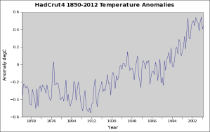
All very well and good. Let’s have a look at some climate data. I will use HadCrut4 as my source, with the data, here. In the data, we are only interested in the year, and the first column, which is the computed temperature.
This gives us quite a nice graphic when charted using Gnumeric,
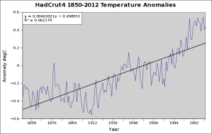
We don’t even need to go through the effort of using those equations to compute the linear trend, we can simply get Gnumeric to do it,
This chart even has the equation of the straight line we’ve reduced the data to (upper left) What’s actually going on, here? Well, the data can be considered a composite,
which is effectively the same as saying the data is the trend + the seasonality + the noise (or error). Least linear squares effectively removes the seasonality and the noise, leaving only the linear trend line.
I’ve heard it said albeit not in a long time, that why can’t we just get a ruler out and draw the line ourselves? Well, human beings are pretty bad at doing that; so we should really use the mathematics.
One might think well, that’s that, then. The trend is up, the climate is warming, it’s based on well understood mathematics that are pretty much beyond reproach. Except that isn’t true.
Firstly, this series is an example of cherry-picking. I realise that that’s quite controversial given that I’ve used all the available data; but cherry-picking it is. The reason is quite simple – I’ve used all of the available data, but not all of the data. We know that climate goes back a long time before 1850, so really, I should be using any number of available climate series that go back as far as I can.
Except you can’t. The technique of linear least squares requires all of the data to be homogenous. That’s to say that the data is collected/observed in exactly the same manner. This clearly wouldn’t be true if we bolted on to the front a climate series that was produced from proxy data like tree-rings, and then switched to using the temperature record in 1850. I note that the HadCrut4 series might not be homogenous, but if you read the paper linked, you’ll find that the boys and girls of the Hadley Centre have gone to extraordinary lengths, as they should, to mitigate this factor. Indeed, they’ve gone to such lengths, that the HadCrut4 series might as well be homogenous – and I will treat it as such.
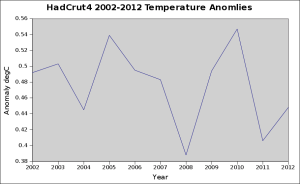
Here’s another example of cherry-picking,
This one is normally used with a straight line with no trend, or a slightly decreasing trend to ‘show’ that the climate has ceased warming. But, as with the previous example, it isn’t just not using all the data, it is not even using all the available data. This is so bad, that I didn’t bother to put a trend line on it (and I’m slightly embarrassed about even posting it)
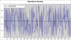
Another point that’s often made is that least linear squares is robust. This doesn’t mean that it is such a strong technique that it evades criticism, it means that it successfully ‘ignores’ outliers. An outlier is a bit of data that is so far away from the general theme of things it might be considered to be an incorrect measurement or such like. Here’s a made up (using Gnumeric RNG function) series,
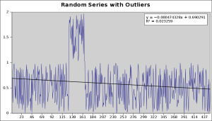
Whilst there is a measurable trend it isn’t significant, and, with a good random number generator, an infinite amount of data points will leave a trend of precisely zero. I simply got as close as I could to a zero trend line. Now, hypothetically speaking, if we added, say, fifty points of outliers – I will use Rand() + 1 to put them in, the trend should still be zero, because they are outliers, and do not express the overall position of the data. Here’s the chart,
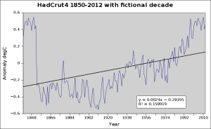
There is now an appreciable trend – even though it is a series of random numbers, throughout, with some outliers, the outliers have forced in a downwards trend. This is not mathematically robust. If we add a fictional warm decade at the front of the HadCrut4, the effect is quite obvious,
In essence, that fictional decade has reduced the trend by half, even though it is just 6% of the series. This is certainly not mathematically robust!
You might recall from plenty of posts throughout the blogosphere that linear trends are frequently used to show that the climate is warming; some will say but look at the trend, it’s up, therefore we are warming. A cursory glance confirms this, but again, does it stand the test of experiment?
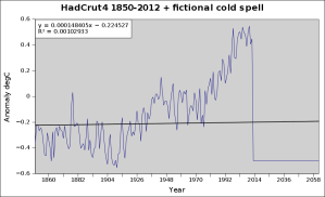
Well, unfortunately, the answer is no. If we pretend that for some reason the temperature record posts some 50 years of a -0.5 degree anomaly, would we still say that the climate is warming? We’d know that it wasn’t – we’d be cold, going hungry, and no doubt, wars will be fought over important things like food, water etc. What does the chart look like? Well, here it is,
The trend line is fairly flat, but if you look at the equation of the trend line (top-right) you’ll note that technically least squares regression is still reporting that the climate is warming.
Would you say in this case that the climate was still warming?
I didn’t think so.

